
Sample a diagram color with PowerPoint Eyedropper
In desktop PowerPoint, use Eyedropper from a shape's fill controls to sample a color already visible on your slide. This is useful when two parts of an original diagram should share the same fill. Select the receiving shape first, activate Eyedropper, and choose the source color. Sampling changes the selected shape's color; it does not create a permanent relationship between the two objects.
Make a controlled practice slide
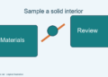
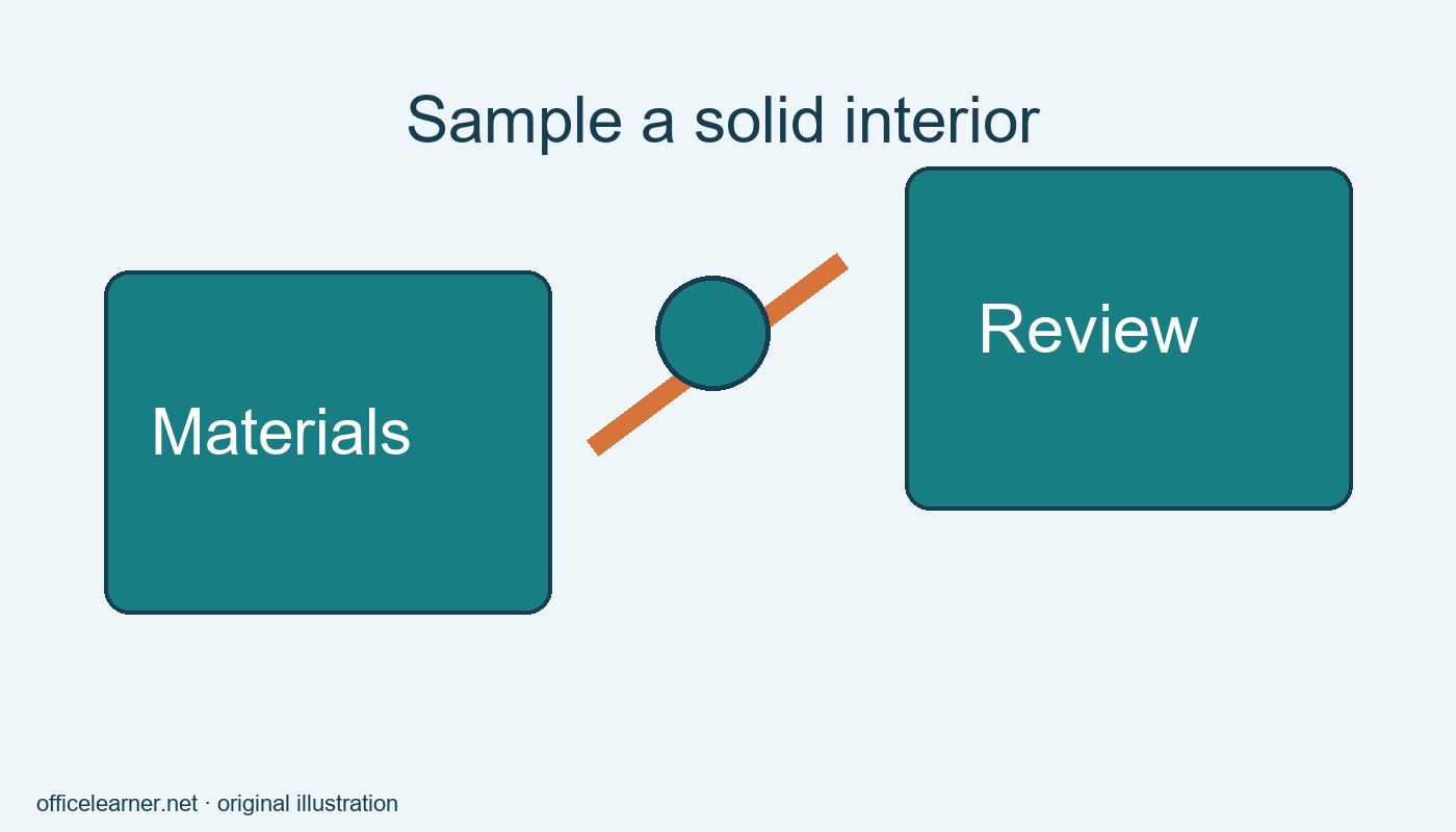
Create a blank slide and insert two large rectangles with space between them. Label one Materials and the other Review. Give Materials a solid teal fill using an ordinary theme or custom color. Give Review a contrasting temporary fill. These are invented workshop stages, so no brand color specification is implied. Use text with enough contrast to stay readable on both rectangles before you begin matching the fills.
Select the Review rectangle by its border. Open Shape Fill on the Shape Format tab or the relevant drawing controls, then choose Eyedropper. Move over the solid interior of Materials and click the color you want. Avoid the text, outline, and selection handles: those may have different colors. The Review rectangle should now use the sampled fill. Press Escape to cancel the sampling tool if you decide not to choose a color.
Inspect the match carefully
Click a blank area of the slide to remove selection outlines. Compare both rectangles at the size a viewer will see them. The goal is a shared fill, not identical outlines, fonts, or dimensions. Eyedropper copies a color rather than all formatting. If the outlines still differ, adjust those separately only if your diagram requires it. This distinction prevents a small color task from turning into an uncontrolled redesign.
Try sampling near a letter on the source rectangle and observe why precision matters. A sample from the text might make the receiving shape dark instead of teal. Undo that experiment and sample an empty central area again. For a photograph or gradient, nearby pixels may vary, so there may not be one uniquely correct color. Use a clearly chosen area and inspect the outcome rather than assuming any click will produce the same result.
Decide when a sampled color is suitable
A sample is convenient for a small illustration assembled from your own shapes. For a formal brand presentation, obtain the approved color specification instead of sampling an uncertain screenshot. Image compression, display processing, and antialiased edges can change the pixel you select. A visually plausible match is not proof that it equals an organization's required color value. Enter the approved value directly when precision is part of the requirement.
A sampled fill is also a static choice. If you later change Materials to orange, Review does not automatically follow merely because you originally sampled teal from it. Reapply the desired color or use a consistent theme strategy for a larger deck. Before handing off a reusable template, explain whether the shapes use theme colors or fixed sampled values so the next editor understands what will respond to a theme change.
Preserve meaning and readability
Do not use matching color as the only indication that two objects belong together. Add short labels or a meaningful connecting arrow where the relationship needs explanation. A slide may be printed in grayscale, viewed on an unfamiliar projector, or read by someone who distinguishes colors differently. Clear wording makes the relationship understandable even when the fill colors are difficult to tell apart.
After sampling, check text contrast again. A dark source color may require light lettering, while a pale source may work better with dark lettering. Do not assume the temporary text color remains suitable. For this exercise, the labels Materials and Review should be readable without zooming. If they are not, change the lettering or choose a different accessible palette rather than sacrificing legibility for an exact visual match.
Troubleshoot the receiving object
If the wrong object changes, undo and inspect the selected shape before reopening the fill menu. Selecting text inside a shape can expose text formatting controls instead of the shape fill you intended. Click the shape border or choose it through PowerPoint's selection tools. If the command is unavailable, verify the platform. Microsoft's Eyedropper guidance covers the desktop PowerPoint applications; browser and mobile experiences do not necessarily expose the same feature.
This walkthrough focuses on sampling from objects on the current slide. Sampling elsewhere on the screen can involve platform-specific gestures, so use the official instructions for your version before extending the task. Work on a duplicate slide when experimenting with a presentation that matters. Keep your original colors available until you have checked the revised slide in context with its neighbors.
Finish with a small challenge
Add a third shape labeled Pack and sample the same teal interior. Then change Materials to a different fill and predict which other objects will change automatically. The expected answer is neither: the samples are independent color assignments. Restore a consistent palette and save the deck. Describe when you would use a sampled color and when you would ask for an approved specification. That decision matters more than memorizing the location of one menu command.