
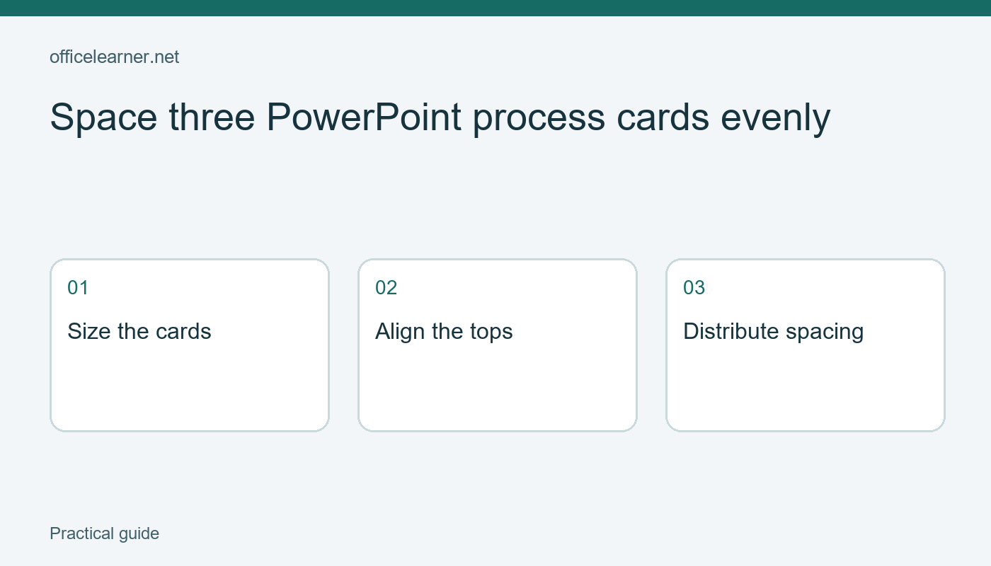
Space three PowerPoint process cards evenly
To make three process cards look orderly in PowerPoint, give them consistent sizes, align their top edges, and distribute them horizontally within a chosen span. Inspect the result at presentation size rather than relying only on a zoomed-in editing view. This exercise uses three fictional workshop steps and ordinary shapes. It does not require an AI layout feature or claim that spacing alone makes a slide accessible or effective.
Define the slide before moving shapes
Create a blank slide in desktop PowerPoint for Microsoft 365. Add a title, Workshop preparation, and three rectangles below it. Type Choose materials in the first, Prepare tables in the second, and Welcome participants in the third. Use short text so the exercise concentrates on spacing rather than paragraph fitting. Put the rectangles in their intended reading order from left to right. Do not worry about precise alignment during this first rough arrangement.
Imagine that the audience will see the slide from the back of a room. The three cards should read as one sequence, with enough room for the words and enough separation to distinguish the steps. Before opening alignment tools, decide how much of the slide the sequence should occupy. Leave a reasonable margin on both sides and space below the title. A mathematically even arrangement can still feel cramped if you stretch it to the very edges.
Make the cards comparable
Select each rectangle and inspect its height and width in the shape formatting controls. Give all three the same dimensions for this practice example. Exact measurements are less important than consistency and enough room for the longest label. If the third label wraps while the others do not, either allow a deliberate consistent two-line treatment or widen all the cards. Do not shrink only one card's text to squeeze it into a narrow box.
Choose a readable font size and sufficient contrast between text and fill. Avoid using color as the only indicator of step order. Add plain numbers if sequence matters. For example, the labels can begin with 1, 2, and 3, so the progression remains understandable in a grayscale printout. These are authored design choices for the example rather than measurements from a user study. You should adapt them to your audience and delivery conditions.
Align and distribute in separate operations
Select the three rectangles, using Shift-click or the Selection Pane if objects are difficult to reach. Open the Align options under the relevant Shape Format or Arrange controls. Choose alignment relative to selected objects for this exercise, then align the top edges. Next choose Distribute Horizontally. Microsoft documents these alignment and distribution commands, although ribbon paths vary between desktop platforms and releases. Check the current menu labels in your installed version rather than following an assumed screenshot.
The first and last cards establish the outer span when distributing selected objects. Position those endpoints intentionally before repeating the distribution command. If you instead align relative to the slide, the result may use the slide as the reference area and differ from your intended group. Undo if the objects jump unexpectedly, inspect the reference setting, and try again. Keep alignment and distribution as separate decisions: one controls an edge or center line, while the other controls spacing along an axis.
Test the arrangement with a change
Move the middle card slightly to the right, leaving the outside cards in place. Select all three and distribute horizontally again. The middle card should return to an even arrangement within the chosen endpoints. This small exercise makes the command easier to understand than repeatedly nudging shapes by eye. Now change the middle card's height and align the tops again. Notice that equal top edges do not imply equal bottom edges when heights differ.
Keep the equal dimensions for the finished practice slide. Then inspect the actual text placement inside each shape. A card with extra paragraph spacing can look misaligned even when its rectangle is perfectly positioned. Compare internal margins, paragraph spacing, and vertical text alignment. The tools arrange objects, but they do not automatically make every piece of text visually equivalent. If something still looks wrong, examine the contents instead of endlessly adjusting the outer coordinates.
Review in slide show and handoff
Start the slide show and read all three steps aloud. Check whether the audience can understand the sequence without an explanation of the layout. Return to editing and inspect the slide at a smaller zoom. Make sure there are no stray shapes, accidental selections, or cards covering the title. If the deck will be reused by a colleague, give the slide a clear title and add a short speaker note explaining the intended order and any local preparation details.
As a final exercise, add a fourth step called Check the room. Decide whether four cards still fit comfortably on one line. If the words become too small, consider two rows or a second slide instead of squeezing everything into the original span. Record why you chose the final arrangement. Can a colleague add one more step without guessing the spacing rule? A maintainable slide communicates its structure clearly enough that the next editor can preserve it.