
Give a OneNote reference page a pale background color
In desktop OneNote for Windows, use View and Page Color to give an individual page a background color. A pale background can distinguish a workshop reference page from working notes, provided its title also describes its purpose. This example changes one page and checks its readability. Page color is a visual cue; it does not create permissions, change the page's subject, or replace a clear page title.
Microsoft's current help lists OneNote for Microsoft 365, OneNote 2024, OneNote 2021, and OneNote 2016 for this desktop feature. Other clients have different capabilities and menus, and a browser view may not show desktop page styling the same way. If collaborators use different clients, check the actual page in those clients before relying on color to communicate anything essential. This tutorial does not assume identical rendering everywhere.
Prepare a reference page
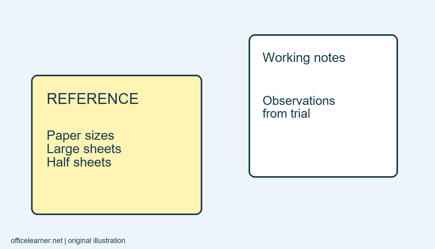
Create a practice page called Workshop paper sizes reference. Add three short lines: Large sheets for posters, Half sheets for individual activities, and Narrow strips for labels. These are original example notes, not a prescribed paper standard. The title should make the page useful even if every background color is removed. Avoid naming it Yellow page because that gives readers little information about what they will find there.
Create a second page called Workshop observations and add one sentence about a trial activity. Leave this page with its ordinary background. The contrast gives you a simple way to inspect the scope of the change: one reference page should receive the color, while the observations page should remain ordinary. Save or allow the notebook to synchronize according to your normal workflow before experimenting further.
Change only the selected page
Return to Workshop paper sizes reference. Open View, choose Page Color, and select a pale available color. Use a light shade with your existing dark text so the content remains easy to read. Click within the note area and review the full page rather than judging only the small swatch in the menu. The same color can feel different across a large background and a tiny control.
Now select Workshop observations. Confirm that you did not accidentally apply a different kind of notebook or section customization. Return to the reference page and inspect its title and body again. Microsoft's desktop instructions distinguish page background from section tab color. If the tab changed but the note background did not, revisit which command you used rather than repeatedly choosing new colors in an unrelated menu.
Pair color with meaning in words
At the start of the reference page, add: Reference notes for choosing paper sizes. On the observations page, write: Working notes from activity trials. These descriptions help a person understand the difference without seeing colors at all. They also help when notes are copied into another document or viewed with a tool that represents page content differently from the desktop application.
Keep the color system small. If every page receives a unique shade, readers may struggle to remember the meaning. For this exercise, one pale reference color is enough. There is no need to color all pages in an existing notebook or redesign a shared structure. A useful cue should reduce a decision for the reader, such as recognizing that a page contains stable reference material, rather than adding a new code to memorize.
Check text and inserted material
Read every line against the new background at your normal viewing size. Look at links, colored handwriting, highlighted words, and pasted images if the page contains them. A background that works with black typed text may make a yellow highlight difficult to notice. An image with a white rectangular background may also stand out more than expected. Decide whether the page color still helps once actual content is present.
Do not recolor text merely to make the page more decorative. If a link becomes hard to recognize, choose a more suitable background or return to the original appearance. The reference page exists to answer a practical question quickly. A visual distinction is worthwhile only if readers can still scan and interpret its content comfortably, including when screen brightness or ambient lighting differs from your own setup.
Review shared and exported views
If another person will use the notebook, ask them to open the reference page in their usual client and report what they see. Give the page title as the way to find it. Avoid instructions such as open the yellow page, since color can differ or be absent. This is a modest check of a shared workflow, not a claim that a particular color improves learning or productivity for everyone.
If you print or export the notes, inspect the actual output. Background colors can be handled differently by export choices, printers, or applications. Verify that the title and opening description remain sufficient when the background is white or grayscale. If the distinction disappears, the written reference label should still preserve the page's purpose. This approach makes the color an enhancement to the content rather than its only organizing signal.
Revise the cue after use
After one workshop, review whether the pale background helped you find the reference material. If you kept searching by title, perhaps the title was already sufficient. If collaborators interpreted the color differently, simplify the convention and write down the agreed meaning. A personal notebook can tolerate informal cues; a shared notebook benefits from conventions that other people can understand without guessing.
As an exercise, add a second reference page called Workshop label wording reference. Give it the same pale background and a descriptive opening sentence. Leave a new observations page plain. Open the pages in a different order and identify each one's purpose from its text first, then its appearance. Which cue would remain reliable if the page were printed without color or opened in a different OneNote client?